HomeFeaturesPentiment
How Obsidian Entertainment resurrected dead fonts for PentimentDesign director Josh Sawyer tells us no feature took as much time as the text rendering
Design director Josh Sawyer tells us no feature took as much time as the text rendering

It’s probably not a huge surprise to say thatPentiment, Obsidian Entertainment’s visually intriguing mystery set in 16th century Bavaria, required a lot of historical research during development. What may surprise you, however, is how deep these historical details run throughout Pentinment’s DNA, right down the game’s text fonts. Obsidian design director Josh Sawyer told me all about how the team revived long-dead historical fonts, to give them a new life in a modern format.
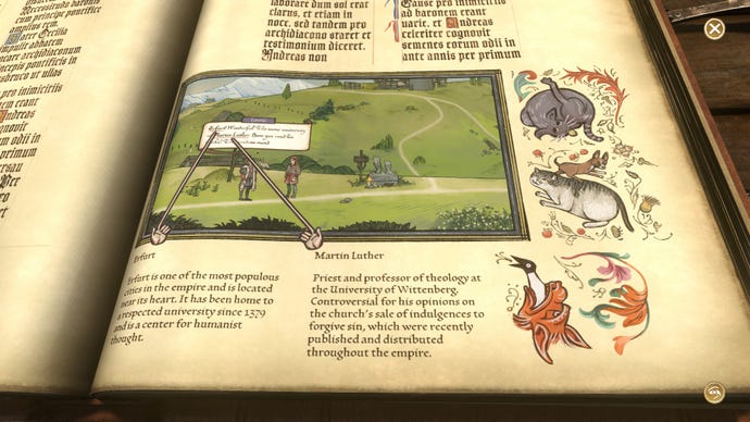
Pentiment puts you in the shoes of Andreas Maler, a journeyman artist working in an abbey in Tassing, Bavaria. His work as an artist is quickly waylaid when Maler finds himself tasked with finding the killer behind a shocking murder that rocks the town, and, like any good would-be detective, the player finds themselves interviewing the locals to get to the bottom of the mystery. Almost everyone, it turns out, has a secret. In the absence of voice acting, Pentiment instead relies on its fonts to help the player to get an understanding of both who its cast of characters are, and how they feel about the world around them.
Pentiment – Official Launch TrailerWatch on YouTube
Pentiment – Official Launch Trailer

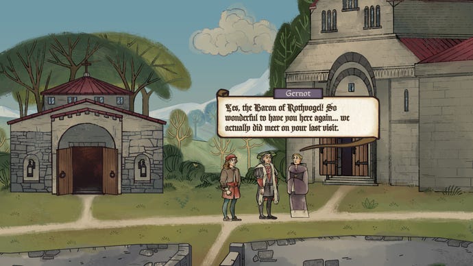
That use of font choices to communicate information about a character goes beyond simple class distinctions. A character’s font will change as the player learns more information about them, reflecting Andreas’ changing opinion of that person. It was a feature that, as Sawyer himself admits, initially confused players during the testing stage, when a character would suddenly shift from one front to another.
For instance, when the player encounters Baron Lorenz early in the game, he speaks in cursive script as Andreas perceives him as a wealthy man who presumably knows how to read and write. However, the more Andreas talks to the Baron, he comes to realise that he is extremely well educated - and is well-read in many of the same topics as Andreas himself. As such, Lorenz’s font shifts to the same one Andreas uses, presenting the two characters on an equal intellectual playing field. “The more we used fonts to show how characters changed, or how Andreas’ perspective on them changed, the more people picked up on it,” says Sawyer. “I was really glad we didn’t need to have an aside where we said: ‘Andreas now thinks this!’ People just understood what it meant.”
Choosing the right fonts was just one hurdle to clear, however. Another challenge for the team at Obsidian were the text animations. The dialogue in Pentiment appears as if it’s being written before the player’s eyes, complete with spelling mistakes and ink splatters. It’s an effective technique in action, slowly drawing the player’s focus onto each and every line. When married with the custom fonts, however, it also turned out to be a huge amount of work.

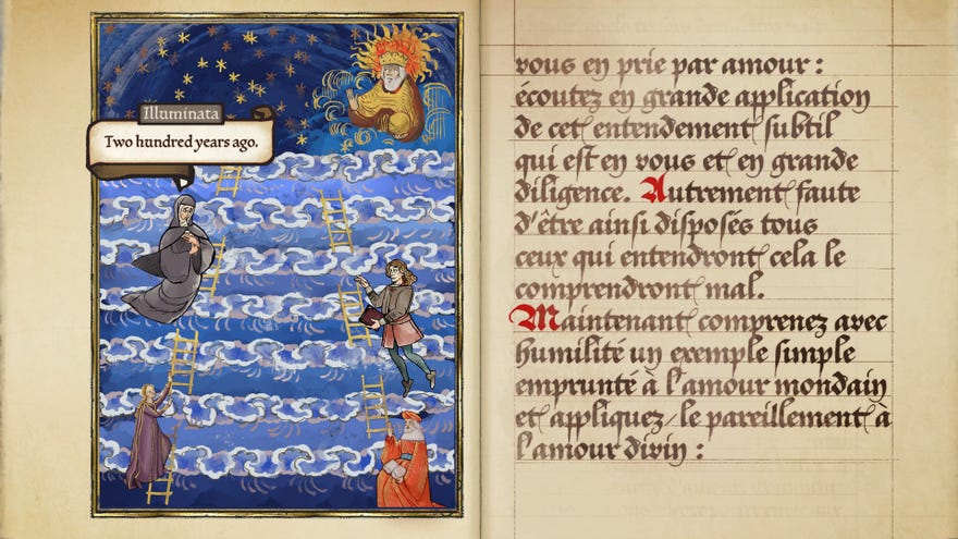
The variety of fonts meant the team needed a variety of animation styles for them - with both handwritten and printed scripts in the game, each of which appear in their own unique ways. The more artistic Humanist scripts first appear as an outline, as in reality they would have been silver pointed in prior to inking them.
Animating the cursive scripts, however, presented a unique challenge. Given the nature of cursive writing, they could hardly have one letter appear at a time - the whole point is to keep continuous motion with the pen, after all. But the Obsidian team not only found a way to animate their cursive font, but did so in a way that recreated the physicality of writing with ink itself. At the start of a sentence, the game overloads the font, causing the ink to bleed past the edges. As the writing continues, the ink thins until it becomes a normal letter form, gradually becoming semi transparent as it starts to run out. That leads to a slight pause, as if the writer is dipping their pen back into the ink, before the font becomes overloaded again.
“When you look at it written out, you have that sense of the writer running out of ink. We even have the splatter effects to show when a character is getting angry,” says Sawyer. “We really wanted to create the sense of physicality, creating the sense of a human being actually doing this and the labour that’s involved in it.”
Both in the fonts and in the wider game itself, the development team went to great efforts to keep Pentiment as historically accurate as possible. Still, that’s not to say that they weren’t forced to make a few compromises. While the game has an accessibility mode that further simplifies the fonts, even the unaltered version of the game has made some alterations to the more fiddly ones. Some fonts required more work than others, with Sawyer paying particular attention to the print typeface Druckeryn, based on the work of French engraver Nicholas Jensen: “What I think is really striking is that you can go back to his original letter forms, and they’re totally readable. It’s unbelievable how clear it is, and that it survived for hundreds of years and is still totally fine”
The same cannot be said, however, for fonts such as Fraktur, which became popular in Germany during this era. “Whether or not you know German,” adds Sawyer, “that font is difficult to read today.” As a remedy, Obsidian worked together with Lettermatic to take what was characteristic and stylish about some of the more problematic fonts in order to recreate a version of them that stayed as loyal as possible to the originals, while ensuring they were readable for players. So the dagger-form tails on Fs in the cursive scripts remained, while the illegible capital letters in the monastic scripts were updated to modern standards.

“We essentially just Romanised them to make them work for a modern eye,” Sawyer explains. “But we retained the structural components, keeping to the spirit of the scripts. I think any book historian who looks is going to see that we made compromises, because they know it’s really hard to read. But if the spirit is there, and it’s conveying what we want it to, then we make compromises to just make it readable, because that’s obviously very important.”